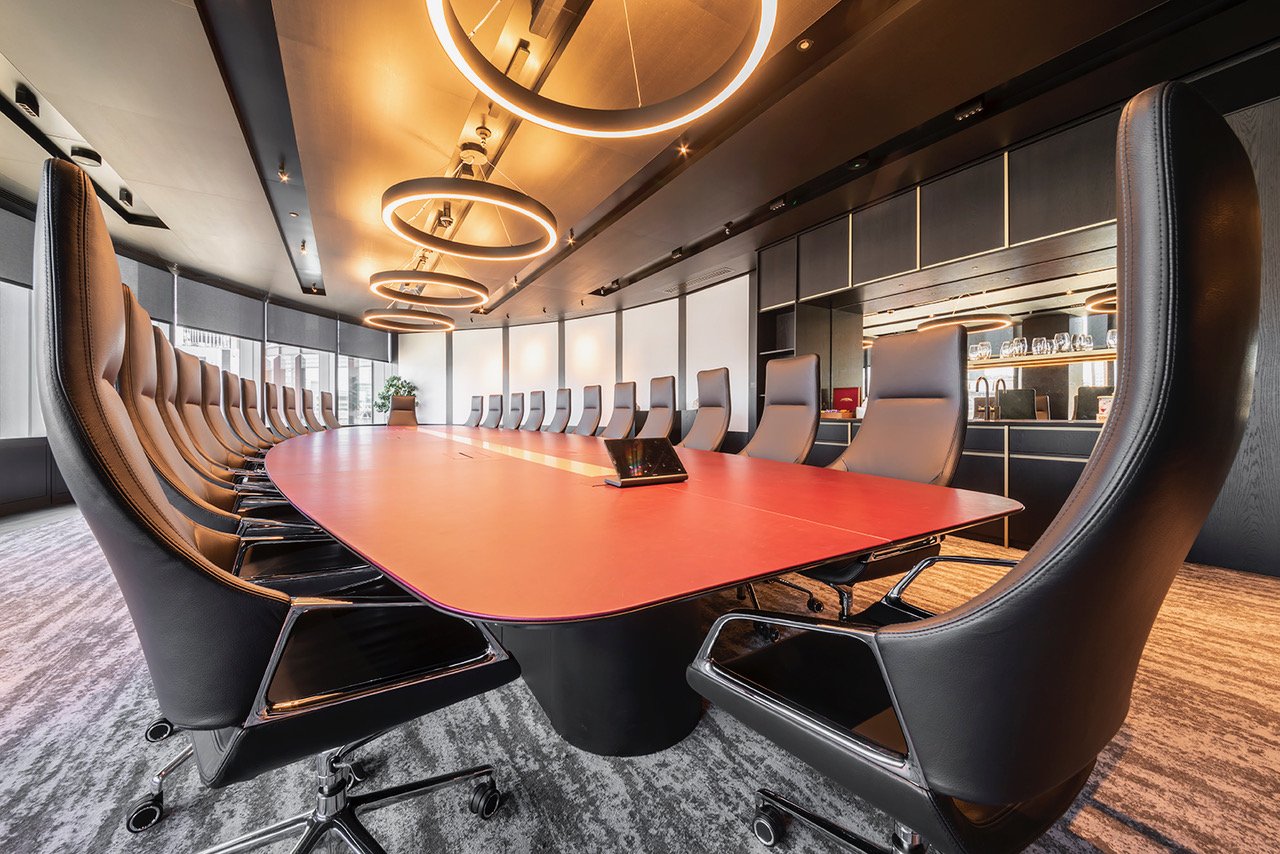
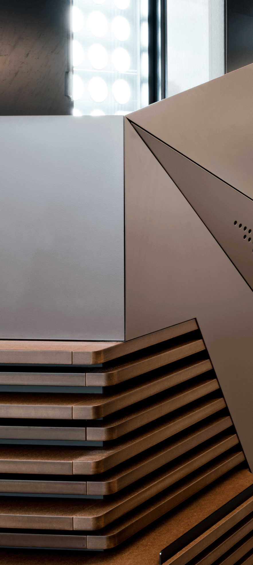
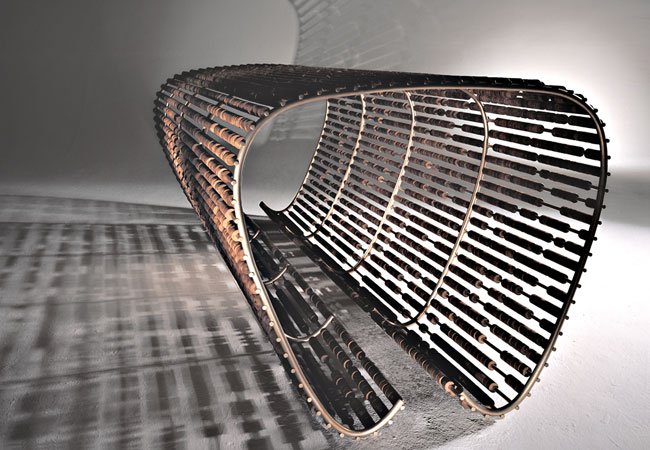
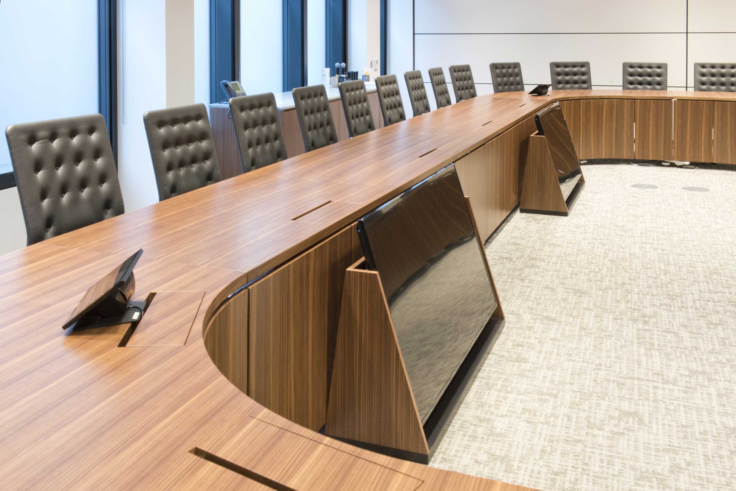
CBA
Opus Magnum won the commission to produce a series of meeting tables for this project at One New Ludgate. There were a mixture of designs including very wide (1500mm) flip-top tables from our Exchange Plus range and under-floor fixed tables. The latter allows for excellent unimpeded leg room on narrow rectangular tables.

The Department Store
Dramatic lives can be read on the faces of those living them. That’s true for buildings too.
Squire and Partners spectacular new home in Brixton now displays its colourful history with pride: from grand Edwardian origins to the scars left by squatters.
We were invited to provide much of the furniture for this lovingly re-imagined structure. All four storeys. About 500 bespoke pieces. 95 tons of high grade birch plywood alone.
So, just on sheer bulk, this was one of our biggest jobs. But, actually, what made it special was the close creative partnership with Squire in realising our part of their vision.
The building was originally part of Britain’s first purpose built department store. Then followed soulless office conversions, squatters and the final shame of derelict dilapidation.
Now, each layer of that past has been peeled back within a breathtaking modern transformation.
Floors have been opened to form vaulting spaces, topped by a whole new level and a spectacular glazed dome.
The renovation uncovered wonderful original features. Many have been fully restored and incorporated.
What’s been preserved chronicles a journey through time. There’s the ‘decayed decadence’ of verdigris on old metalwork, faded layers of paint and historic damage.
Squire also retained examples of graffiti left by former ‘tenants’ – those squatters could be pretty artistic.
Naturally, some things had to go – including a number of fine old pine joists. Loath to skip them, Squire asked us for ideas on finding them a new role.
Seeing the complex swirling end grain patterns, we suggested they’d make a gorgeous veneer for a multi-purpose showcase surface.
1500 cuts went into the six metre table pictured. Its leaves separate and link seamlessly in various configurations for meetings, displays or dining.
However, our top priority was creating a home for Squire’s 150 staff within this amazing architectural Tardis.
The Squire team was fully engaged with the detail for all the office furniture. That was fantastic. The original brief came in 30 separate design files. What followed was an evolution of ideas.
We welcomed them to the workshop during development and prototyping perhaps more often than on any previous commission. Between us, those designs were repeatedly tweaked, revised and improved. The result…..
In all, we supplied:
- 220 desks, half with overhead storage
- 70 standalone storage units
- Extended printer and resource areas
- Other bespoke tables, desks, credenzas and individual items
Nearly everything is modular, moveable and adaptable. Desks link without requiring tools. Cabling is dead easy.
The Department Store remains a work in progress for Squire. After contributing to its dramatic history, we’re looking forward to being part of its exciting future too.

Canary Wharf Office
‘We’d like to push the boundaries on this, to make it a bit different.’ That’s not the line we usually expect from large accountancy firms visiting our workshop.
Then they uttered the magic words. ‘Could you come up with a design?’ Say. No. More. Oh, did we have fun with this presentation.
But do we hear you say “aren’t those just, er, rather sober table tops?” You’re not looking in the right place. ‘A bit different’ doesn’t have to mean hipster tech start-up crazee. (Of course, it can if you like.)
Take a peek beneath the surface. The support cladding is powder coated steel, combining panels at different levels and angles. It looks totally random. And, if you think that yellow flash is a bit, well, flash, it is actually part of the corporate branding.
Many of these tables appear improbably balanced on a knife edge. Sub-floor steels provide the stability. Others have slim cross member legs which combine support with unimpeded seating.
Now, anyone who has worked with us knows we get a bit passionate about cable management. How to do something new, something better. Here, rather than have the flaps blend into the surface, the angled edges become a graphic feature, closing to create a geometric pattern.
You want different. You get different.

Bodleian Libraries, Oxford
Architect – WilkinsonEyre
Even within Oxford University, the Bodleian Libraries hold a special place. Once again, we partnered Wilkinson Eyre, who completed the transformation of the Weston Library building from a glorified warehouse into a fitting home for Magna Carta, a Shakespeare First Folio, an academic treasury plus an exhibition area.
What an honour to be asked. Actually, it was a bit like doing a PhD: extended, original and a teensy bit nerve wracking, even for us.
Wilkinson Eyre are great architects. They’ve done an amazing job. Perhaps part of their skill is knowing who to approach for interiors to match that vision. We’ve featured the ground floor information desk. It’s honed Jura limestone, like the paving, with gilded aged bronze cladding.
Previously a four storey book stack, it’s now a vaulting, open area faithful to Sir Giles Gilbert Scott’s original design.
The breathtaking roof level reading room is the only new build element. OpusMagnum staff are already masters of their crafts. But you could say that furnishing these rooms has qualified us for a doctorate in deskology.
Our field was defined by the main contractor, Mace. With Wilkinson Eyre as ‘thesis supervisor’, we developed prototypes for rigorous scrutiny by the library authorities.
The result is these European oak desks with a flush lino inset. The central bands, cable management flaps and unobtrusive LED strip lighting gantry are wax finish bronze
Picture three is our imposing new home for the Blackwell Collection. Three metres high and almost five long, it is postlipped in solid oak with bronzed metal glazed doors.
The reading desks in the next four images look simple. But appearance can be deceptive. Those with gaps on the end plinth are adjustable. And not by the usual paltry few centimetres. They can be raised 30cm – or lowered by 10cm for wheelchair users. They’re very popular. Cable management is push button operated.
A particularly nice feature emerged during prototyping. Once we knew the chair design, we made the desk under-chamfer correspond with the angle on its arms, allowing them to tuck neatly under.
Altogether, we worked on more than 200 separate items. Desks were also tailored to the research material: for example, foam wedges support fragile spines and some are extra wide for maps.
80 historic desks were adapted for cable management and lighting.
Considering the scale and the scholarly context, this project is jockeying for position as OpusMagnum’s Magnum Opus – so far. All we need now is that PhD certificate.

King’s School, Worcester
Architect – Associated Architects
This shelving system was such a great project to work on. It also scooped up prizes: the 2007 Wood Award for innovation and a 2008 RIBA award. It’s fantastically creative but the material used is just ordinary sustainable birch plywood, with a water based lacquer.
Let’s start with the detail and work out to the bigger picture. First, the thin, cantilevered shelves; developed by us to be moveable while remaining totally safe.
The bookends are chunkier but the proportions serve to rebalance and complement the horizontal lines.
The entire structure is amazingly stiff and stable. Nothing’s resting on the floor.
As a bonus, the design produces these vibrant three dimensional crenellated sides.
The big bookcase is also a room divider. A staircase is just visible through it.
Opus Magnum manufactured the reading tables too. They are in rotary cut figured birch, some with full length Corian light boxes overhead.
Produced to a school budget, the whole installation shouts ‘quality’.

Reception Desks
First impressions count. The reception area says as much about a company’s attitude as its annual report does about its finances.
But there’s no point having desks that make some dramatic statement if they don’t perform the practical functions too. Ours do both.
We’ve featured reception desks in several other projects. But here we are highlighting a few more that we think are a bit special.
Ernst & Young, M Moser Associates. An expansive area where circular backlit Corian against a blue panorama of clock faces and screens seems to say “we’re on watch 24/7”.
Royal London Hospital, HOK. We supplied a series of concrete and steel desks. Sometimes the glass had to be bullet proof.
CIPD, GMW Architects. Deliberately understated in curved backlit PETG acrylic. The Chartered Institute of Personnel and Development serves its members, as they serve the businesses they work for across the public, private and voluntary sectors.
Seymour Street, Fielden & Mawson. A desk strongly rooted in the company culture with a plane tree veneer. They manage many of London’s signature plane trees and wanted that as their signature too. Dramatically cantilevered off a clad concrete block, this desk’s actual roots go down a long way: it’s bolted to the floor below.
Davis House with Joanna White. We love Joanna’s cheeky ‘peek-a-boo” effect. With the lights off, the desk is plain smooth Corian. Flick them on, and the sculpted reverse becomes translucent, like the wall in the distance.
Whatever you want to say, we’ll make sure your visitors get the message.

University of London
Architect – BDP
Giving something wonderful a new lease of life: that was how we approached this extensive project at the university’s Senate House Library.
Dating from the 1930s, this listed building’s glorious interior was styled by Charles Holden. Could you improve on that – and why would you want to try?
The only thing was, he never had to think about cabling it up for computers and the internet.
If anything, data management is our USP, to use the jargon. So, taking Holden’s original pieces and discreetly retro fitting power and data sockets was right up our alley. Now they should be good for another eighty years.
All the new fittings we added are in complete harmony with that interior.
The work was in two stages.
Stage One was rewiring and refitting the Deco tower and Catalogue Hall with its Hornton stone columns and bronze gilded metal panels.
Our main picture is a detail of the additional gilding. Chemically aged to match the original, the university was delighted with the result.
Those desk tops are solid walnut. And that stonework is from the original source. It looks like it’s been there for ever.
On the second row of images is the reception area with its listed travertine walls. The new desk is silicon bronze with a travertine base.
The arch uses metal structurally as well as decoratively. The university emblem is etched into the glass panels.
You can also see the reading rooms. The desks here are all new, featuring solid walnut edges, lino panels and a bronze lighting gantry.
The third row is Stage Two. It is in a post-war wing. So it’s a bit different.
Desks have individually controlled LED lights. The display cabinets are in crystal clear low iron glass. Their sliding doors have concealed runners.
These photos by Sanna Fisher-Payne capture a more contemporary feel that retains echoes of the 1930s. Like the stunning panelled wall we built in the main lecture theatre.
Influenced by an original detail on the building facade, it’s visually very strong. It’s just one colour. That textural richness comes from the variations in thickness and sheen of its interlocking panels.
On a conscious level, all this harmonisation may pass most students by. But it means they can absorb the same experience as their predecessors.

Victoria Offices
Architect – Swanke Hayden Connell
‘You want it when? Seven weeks!! Er…OK, no problem.’
This international company based in Victoria needed conference, training and telepresence rooms up and running in about the time it takes to have a sofa delivered.
However tight the schedule, cutting corners was never an option. Indeed, with facilities like telepresence involved, cable management was extra tricky.
But we got there. The veneering is beautiful. American white oak, with a delicate bronze inlay. The modesty panels have a pigmented polyester lacquer facade.
Besides fixed training desks, there were ‘Exchange’ flip tops and slim credenzas, sporting bronze powder coat legs plus shadow gap handles.
And, as the clock ticked down, we made full scale templates to locate the floor boxes precisely. The tables went in. That complex cabling disappeared.
Job done. Deadline met. Phew.

Toronto Dominion Bank
Architect – HLW
There’s lots to say here but let’s start with “sustainability”. TD Bank’s London fit-out has an exceptionally high SKA rating for environmental performance. This is becoming increasingly important and it’s an approach we and HLW strongly support.
Knowing that may be one reason why they specified us for this job – which is always nice.
We get a thrill from the vibrant atmosphere they generate and their use of colour. That’s clearly demonstrated in our first photograph.
This seemingly modest credenza oozes refinement. The right hand door is on a mitre hinge. The adjoining shelf lining is mitred too. The way they meet is a joy.
All the furniture is a combination of polished stainless steel and straight grain oak. And TD Bank was definitely thinking big.
The flip-top tables were amongst the largest we’ve ever made – 2800mm x 1500mm. They’re pictured linked almost seamlessly in sets of three, using swivel plates. The rest would connect up too, if required.
But it’s more likely that they’ll be separated and cleared to make room for functions. From the size and extra thickness, 40mm, they look both very solid and dauntingly heavy to move. They’re not. They’re constructed around a lightweight honeycomb core.
In addition, all the tables have Opus Magnum’s retractable CAT6 data cable spool; eliminating the need for fly leads.

Synagogue, London
Designer – Francesco Draisci
This prizewinning concept design set a big challenge: the doors of the 4000mm high Ark needed to open with ease but close absolutely flat.
Our solution, adapted from the aviation industry, a stiff lightweight aluminium honeycomb core.
It’s normally a support for airplane wings.
We were not aware of it being used this way before. Laminated in plywood with an olive wood veneer, the weight reduction was dramatic.
Inside, the contrasting gold finish highlights the beauty of the scrolls of the Torah with their velvet covers and silver ornaments.
The use of olive wood, with sapwood specifically requested, is not simply decorative. The tree has great symbolism in Judaism, hence its choice for the Ark and the Bimah – the plinth from which the Torah is read.
It was also used for the ceiling canopy with its eternal lights.
We also developed all the furniture from Francesco’s designs.

SJ Berwin
Architect – HOK / Seth Stein
This could be the Genius Bar of a well known computer company, rather than the office of a leading law firm.
Stroll with us down a glass walled corridor between rows of meeting rooms. All along, the walls glow with different coloured strips of light.
It’s coming from the back of credenzas encased in seamless white Corian. Steel legs bolt them to the floor.
Some of the credenzas are curved. The one pictured is with a lectern that has electronic height adjustment.
This tender also covered several large conference tables. Matching credenzas were sandblasted to accentuate the grain and give a driftwoody effect.
The deli area is interesting too. Now, some businesses look to change their decor like most of us change shirts. But not here. These tables and benches have an extra thick veneer. S J Berwin wants them to last – and that’s how we build them.

SAB Miller
Architect – Harmsen Tilney Shane
Every so often we have a job where the furniture takes a bit of a back seat.
Here in Woking, we worked directly with the main contractor on fitting out the offices of the South African drinks firm, SAB Miller.
We welcome the chance to turn our hand to anything a bit different. In this instance there were coffee and copy points, pigeon holes and lockers.
All were fitted and installed by us with the same attention to detail and craftsmanship that we bring to any of our furniture.
Of course, being a brewer, SAB Miller had a lot of bottle. That reception desk top. What do you think? Corian? Marble? It looks like stone but it’s actually recycled bottles.
If you want to sample the company wares before they’re emptied and broken up, head for the bar we installed.
And, for somewhere to put the beer, how about this dramatic catwalk table in the main reception.
Made from stainless steel and back painted glass, its nine metre length offered plenty of space to display the latest brewing fashions.

Ron Carter OBE RDI
This section is simply a tribute to Ron Carter, our friend, mentor and inspiration. He was perhaps the leading furniture designer of his generation on the British scene. His main career predated the internet which may explain why, as we see it, his work is less familiar today than it deserves.
We were very fortunate that Ron took our fledgling company under his wing. He’d often pop over to our workshop, offer great advice and, through his contacts, many prestigious doors opened for us.
He encouraged us to push our boundaries and to cherish precision.
His draughtsmanship was superb – everything was hand drawn.
Over a long series of great projects together, we learned so much about proportion and line and how restraint makes its own statement.
Here are a small sample. They are classic Ron Carter. They speak for themselves.
The ziggurat desk, curved credenza and oval desk were for a music business. A guitar owned by the Beatles was displayed under the glass.
The Bank of England is an institution that spans the centuries. So, these chairs are built to last. One hundred years? Easy.
And the dining room at Hinxton Hall. Look closely, those ebony like dots in bog oak are replicated on the chairs. A brilliant touch!
Ron died in 2013. We miss his genius. We miss him.

Rolls-Royce
Design – Opus Magnum
This great global brand sets the benchmark for quality, luxury and engineering skill. So, no pressure on us then in designing and supplying tables for the aero engine division headquarters in Victoria.
We’d never claim that this is a Rolls Royce of boardroom tables. But the spec for this project was exacting and drove us to innovate too.
Can you see the slight shadows on the glass stinger? Those dots are magnetic flush caps for microphone sockets.
The desk itself looks like solid European oak. That’s down to a radial veneer extending to the edge, with an under chamfered solid lipping.
This was also when we developed the special low level castors we’ve referred to elsewhere.
Rolls Royce wanted a boat-shaped table seating 24 that was movable while looking firmly fixed. It definitely does: you’d have trouble spotting the wheels or the joins. But it flips into six sections.

Quilter Cheviot
Architect – HLW
This is from one of our other ranges of meeting room furniture, Kimber. As another firm we’ve supplied on several occasions, HLW are very familiar with its qualities.
Kimber is designed to have a more European feel, with large castors a feature on movable tables. Fixed variations have similar shaped legs.
Opus Magnum’s cable management skills are fully present. The flaps are in matching veneers and follow the table shape. Cable exit routes are arranged on three sides of each flap.
We’re particularly proud of the beautiful flush handles on the credenza.
For Quilter Cheviot, HLW selected a finish in fumed European oak. Tannin in the wood goes black on exposure to ammonia.
But you can have any veneer and tables of any size.
These legs are polished stainless steel. There’s also a satin steel finish or a powder coating in any colour.
Kimber gives you lots of interesting options at very interesting prices.

Palace of Westminster
Portcullis House – Hopkins and Partners Moses Room – Opus Magnum
If you watch the TV news, you’ll almost certainly have seen our work here. Opus Magnum fitted out the select committee rooms in Portcullis House.
For Hopkins & Partners, the brief was to produce the perfect setting for what are often dramatic confrontations when MPs take evidence.
For us, it meant 68 tables with a design life of 150 years plus other furniture.
Twelve years on, we take people to see how the four chambers are bearing up. So far, so good.
If wear and tear does take its toll, well, those tables are solid European oak and can be resanded to pristine condition.
See the mikes? Committee proceedings are recorded and can be broadcast across all media platforms. The logistics are immensely complex.
Accommodating all that technology made the task of casting the bespoke steel legs fiendishly difficult.
The central voids links to a specially designed multi-pin plug in the foot which connects directly into sockets in the floor.
Then, we won the tender for refitting the magnificent Moses Room next to the House of Lords chamber. It included the design as well as manufacture and installation.
The hall doubles for committee hearings and functions.
So, the furniture must be removable while retaining all the media capabilities.
This required deft styling and innovative thinking.
These tables are relatively light – the oak is braced by a concealed aluminium frame. And they’re flip top.
Next, those steel floor boxes. The top may look almost medieval. But that’s because these boxes must be rock solid.
Here’s why. When closed, the surface is flush. Open it, and a double pivot raises a stop locking each table exactly and instantly into place. Cabling then just plugs in. Nothing shows. And the committee can meet.

Oriel College
Architect – Marcus Beale
Oxbridge colleges occupy a special place in British society. To get in is a terrific achievement for students. And, for us, being accepted to work on the fabric of these institutions is just as much of an accolade.
In collaboration with Marcus Beale, we’ve been commissioned twice by Oriel College.
First was the refitting of the Pantin library.
The bookshelves are clad in solid oak. We prototyped and developed the design for the readers’ desks.
The curved help desk has a lot going on: different levels, glass, post lipping with flush veneer and a discreet brass bell.
That led to a project – still underway – within the college chapel, which was consecrated in 1642.
This requires a far more traditional style. But we are subtly employing modern technology to solve two tricky issues.
People are generally taller these days. So, the hymn book stands now seem awkwardly low – a problem aggravated by poor light.
Slatted higher level rests with LED strips should help furnish an unintrusive answer, however huge the chorister.

Nicole Farhi
Architect – Gabellini Associates
The line between craftsmanship and fine art can be narrow. Here, we think we crossed it. Along the way there was creativity, challenge, drama and it ended with a couple of naive Brits being treated by the local union boss to a night on the town in the Big Apple.
Winning this tender in 1999 was a major achievement for a relatively young firm. We were to develop and manufacture all the fixtures for the Nicole Farhi flagship store in New York.
In a lovely location near Central Park, it was more like a gallery than a fashion shop.
The couture was to be suspended from elliptical walnut rails that curved and tapered. Some would remain horizontal, others descend to the floor. Vertical rails would support elegantly convex walnut shelves.
The concept was one thing. Working out how it could remain upright was another.
The designs were developed and fabricated here in London. That meant the designer and Ms. Farhi herself visiting our workshop.
She looked sceptical. “Will these rails be strong enough?” she queried. And she rang her office to summon 20 heavy winter coats as a test.
No problem. Inside the rails is a steel core, rigid but still able to flex like wood. Those bronze escutcheons pictured concealed secure floor fixings.
We also made the ‘Abacus Table’. Its silicon bronze frame holds 6,000 turned walnut beads. It is a definitely work of art.
The upholstered benches, with a delightful side chamfer, are also silicon bronze. And accessories were displayed in our walnut laminate trays.
Oh, and that union thing? Well, Opus Magnum installs every job we do. So, we arrived in Manhattan with our truck, as we would in the UK. Back then, we didn’t know about US union restrictions. And we were non-union labour.
After some fancy footwork and negotiation, it was all smoothed out. When the job was complete, the union boss said “Guys, I’m gonna show you New York. Tonight, your money’s no good.”
It was quite a night.

Natural History Museum
Architect – Berman Guedes Stretton
Hermetically sealed and climate controlled, the 310 individually sized drawers in this stunning unit house one of the Natural History Museum’s prized possessions: the Hans Sloane collection of botanical paintings and pressed plants.
It was our responsibility to ensure that this old and fragile treasure remains perfectly preserved and free of atmospheric contamination.
The pull out drawers have gas sprung acrylic lids and rubber seals. They open automatically and soft close. Each is different.
Full scale prototyping was needed to work out exactly the closing mechanism and force required.
The unit itself is housed in the museum’s Cocoon building.
The framework is laminated ash following the curved architecture of the Cocoon. Steel hawsers and ceiling mounted ash braces maintain the stability.
These details have become an architectural feature themselves.
The public can’t enter the room. But there is a viewing port
You may see Hans Sloane’s portrait, which moves along a steel track, watching over the room. We hope he is happy with the way this irreplaceable archive is being kept for future generations.

Moody’s
Architect – Swanke Hayden Connell
Do you see the cables emerging from the table leg? Well, barely. The floor box couldn’t be any closer. To achieve this precision with all the tables we supplied to the ratings agency, we templated the positioning for the boxes.
The tables themselves highlight a match up just as close between modern and traditional skills.
Machining a boardroom table this size to get the side curvature perfect requires advanced computer programming.
But then come the older craft skills, creating a sense of proportion through the use of veneers.
This straight grain finish is book and slip matched. The effect draws the two ends together.
A solid walnut profiled post lipping complements the effect as well as extending the table’s life span.
The general meeting tables are similarly post lipped. And the column legs are centrally positioned for maximum legroom.
The limestone reception desk has a cantilevered American walnut shelf for wheelchair users.

John Pawson
How we first linked up is quite a tale. During Opus Magnum’s early days in the 90s we were shopfitters for the expanding Jigsaw clothing chain. It was our bread and butter.
When they commissioned John Pawson for their Bond Street flagship store, Jigsaw wanted us to work with him.
The rest is history and a series of successful ventures at the highest standard.
From the manufacturer’s viewpoint, John Pawson’s celebrated minimalist architecture is by no means an easier option.
Such refined work demands impeccable craftsmanship. Achieving absolutely clean lines is harder than making embellishments.
The choice of materials is more important too.
We are happy working to these exacting standards, down to the smallest detail – as with this table top and its perfectly straight grain.
That’s why John Pawson selected us for other UK based projects, including a private residence in the Piper building and the Bulthaup showroom in Kensington.

Home Cinema
Design – Opus Magnum
The guys love going from one thing to another. So, we were delighted when a client from one of our best corporate customers invited us to furnish his West London home.
It’s a totally different job working closely with families to make furniture they’ll love to live with, as with this home cinema, office and dressing room.
Architects, designers and craftspeople know the jargon and the technical terms. But for most of us, explaining exactly what we want isn’t so easy.
After careful consultation with the client, we designed a living room AV wall of elm veneers laid in a random fashion (not as easy as it sounds). Spinneybeck suede upholstered doors revealed made to measure storage units.
The dressing room is in figured birch.

Foster & Partners
At first, we fretted. And then we fritted. This demanding design concept seemed to ask the impossible: two 3500mm wide display cabinets with frameless hinged or sliding glass doors – and no mechanism in sight.
The answer, a process called fritting to render the perimeters opaque. Even the high lumen but heatless fibre optic lighting doesn’t cast the hint of a shadow or a silhouette.
All you see is the perfect flat grid the architects wanted for the outside of the HSBC boardroom at Canary Wharf.
Then there’s this swish granite table we did for Foster. And ‘swish’ isn’t referring to the design, though it is that too.
Spanning 2750mm, the 1800mm centre is a weighty revolving glass Lazy Susan.
“My first version worked all right,” says John Baulkwill. “But it did sound a bit like a freight train. So I had to rethink it. Now, it’s more of a ‘swish’.”
It takes the gentlest of touches to get this 38kg disc gliding round on the millimetre flat surface. The laser cut steel skeleton and rollers supporting its smooth action are invisible.
The table was for a private residence at Albion Riverside. We also made these cupboards with their huge 3000mm high polyester gloss doors.

Eldridge Smerin
Design – Eldridge Smerin
Building great partnerships with terrific designers is one of the most enjoyable parts of this business. Eldridge Smerin have been a case in point. We really like how they put the ‘wow’ factor in creating beauty, proportion and practicality even with the most minimal and affordable concepts.
Take these screens we made with them for the Design Council. They don’t look cheap, with their patched handle links and curved laminate corners, but they were. The smart solid wood kitchen tables are archetypal Eldridge Smerin.
This elegant but inexpensive library unit cleverly contains a quiet seating area.
No doubt it’s their concept. But making it work is where we come in. It takes a lot of development, sketching and so many meetings that the chairs can get worn out……
…which is no problem with these beautifully made seats, upholstered in multicoloured felt. When one layer gets worn or dirty, you just peel it off.
It looks so simple. But there’s a lot going on.
Other collaborations include seating for a department store in Kuwait, domestic projects and, more recently, offices for the Oppenheimer group.


Camden Offices
Architect – BDP
This office fit-out was unique in so many ways. Where to start! The minimalist round desk? The boardroom table with a pop-up screen? Or the room length granite top?
And we had to figure it all out. Our design brief had been deliberately left open. BDP trusted us to deliver something special.
“We understand the architects’ language,” says Chris Turner, one of our founders. “It’s the ease of working with us that makes us different. Architects know they can delegate as much as they like to us.”
Let’s start with the boardroom. The table has a leather perimeter with stainless steel inlays and a central walnut panel. Look closely for the cutout housing the screen.
The bespoke chairperson’s desk is supported by columns with a computer access door. It has bespoke screen covers and the table edging is classic Opus Magnum quality in the detail: leather to walnut with metal inlay and shadow gaps.
Around the offices, the circular steel meeting tables have the same inlays. Unfussy and functional, the shape encourages the free exchange of ideas
Moving on to the staff canteen, granite may be very hard but it’s also very heavy and quite fragile. This giant refectory table stretches an impressive 4500mm. To maintain the visual impact, all the supports had to be concealed.

Boathouse
Architect – Alex Cochrane
Living space on boats is always pretty tight. And that was definitely the case for this splendid boathouse on Virginia Water in Surrey.
Yet, in an area barely five metres square, we fitted a kitchen, bathroom, office, perimeter seating and a comfortable central area that doubles as a bedroom. We maximised the space by minimising embellishment.
There are no door handles, for example. They are all touch opening. We also did the stonework: a good example of how Opus Magnum is a one-stop shop handling all materials, not just timber.

Bedford Street Reception
Designer – Joanna White
Unusually for us, the furniture was just a fraction of our work in this Central London reception area. Teaming up with a small contractor, we did the lot – the stone floor, the electrics and all the walls. Oh, and we also fitted a Corian bathroom.
The high gloss walls are lacquered polyester, setting off the straight grain walnut panels and upholstered leather ribbing
The desk is in Zodiac and black glass.
It’s fun and satisfying to take on such a complete and varied project

Charles Russell
Architect – MCM Architecture
An excellent example of how Opus Magnum quality needn’t come with a price tag to match. These tables are from our ‘Exchange’ range and feature our own low profile castors. That means these tables look permanent but they are very versatile.
‘Exchange’ comes in a variety of flip top and fixed tables complete with cable management.
Ideally suited to multi-function rooms, they can be linked together or easily moved.
Typically they cost up to a third less than our individual designs with no sacrifice in quality, making them highly competitive with any middle or upper end manufacturer.

20 Fenchurch Street
Design – Opus Magnum
We took the clients to a specialist mill in Switzerland to choose the perfect figured European walnut veneer for their magnificent boardroom table. This extensive bespoke range was developed with furniture consultancy, Operandum.
It included an impressive underwriters’ hub with a different veneer from the mill. Note the graceful central lectern fixed to the floor.
The boardroom table has several features worth mentioning. The curve follows the arc of a large circle, with the veneer as spokes radiating from the centre. That’s easier to see in the picture taken during manufacture at our London workshop.
The inlay is leather. That arrangement is reversed in the second boardroom table
We also designed furniture for meeting rooms, a library area, executive offices and broker pods with acid etched glass tables.

UK Supreme Court
Architect – Feilden + Mawson / Tomoko Azumi
What a lovely job this was: the sort where you punch the air when you win the tender.
Three courtrooms. Fifteen offices. All different. Plus meeting tables, credenzas and what-nots (we weren’t sure what they were either, at first).
The Supreme Court is a constitutional departure for the UK but one steeped in history. It’s located in the former Middlesex Guildhall, part of a quadrangle bounded by Parliament, Westminster Abbey and the Treasury.
So, you get the idea. This was very special. Both ancient and modern. Everything had to be top notch and pitch perfect.
Right, let’s go to the courts. Two are in panelled rooms – the fittings reflect that. One is a new build – and ditto.
Courtroom One, pictured, is the grandest. This is a nice example of radial veneer on a timber clad steel structure.
In this listed room, we restored and reused the original carved pew ends on new public seating with leather upholstering.
Court Two has a lighter, more contemporary oak veneer.
The detailing for the Justices’ offices upstairs varied according to seniority.
The bureaus are post lipped, with replaceable leather pads. Tomoko added some lovely finesses, like the finger pull on this pedestal.
Beside the desk is the what-not. Lady Hale, the Court’s Deputy President asked for them. Popular in the nineteenth century for displaying china, ornaments and what not, here they convey case papers and files.
One modern touch: the marquetry emblem is laser cut.
So, a historical setting meeting judicial needs today – and for future Justices not yet at primary school, let alone law school.
Did we get it right? Well, you decide. You can watch the televised proceedings or, better still, pop along and try out our fantastic public benches.
Making our legal system more accessible was one of the drivers behind establishing the Court. Being part of that is another reason this was such a lovely job.

Warburg Pincus
Architect – Gensler
This assignment showcases the importance of selecting materials carefully.
A private equity company tracing its roots back to 1939, Warburg Pincus now has an investment portfolio of $50 billion in more than 35 countries.
So we wanted to generate a sense of longstanding stability and security – values not always associated with the financial world today.
The well proportioned credenzas have matt, acid etched, bronze, glass doors. The combination with the walnut finish we chose is satisfyingly complementary.
And, dare we say, it invokes memories of days when having money in the bank meant you could sleep easy.

The Royal Institution
Architect – Terry Farrell & Partners
One of the towering giants in the history of science worked at this bench. Well, not precisely this one. For the Royal Institution, we broke one of our unwritten rules: we made a reproduction. And it was fun.
The actual bench Michael Faraday used when he presented his Christmas lecture in 1825 was delapidated beyond repair. But this is a faithful replica. The lecture itself has become an annual televised event. Watching it, you can’t spot the difference. We even copied the sink, for practical demonstrations
Obviously, if Faraday presented it, he’d notice. Powers of observation aside, our version is electronically height adjustable and can be easily dismantled and wheeled out.
Many of our projects require furniture in keeping with the architecture. Here, the bench is a keystone in the architecture of this Grade 1 listed building in Mayfair.
If all that science and history leaves you needing a drink, head for the bar. We also fitted that and supplied other bespoke work too.

Squire Saunders
Architect – Jacobs Webber
We like showing prospective clients this project – especially if they’ve lingering concerns that our standard ranges could be a bit, well, samey.
At Squire Saunders there is a little of everything: Scottish leather, Arabescato stone, smoked eucalyptus sourced in London, figured and burr European walnut via Switzerland.
The list goes on: marble, steel….. so many wonderful materials from around the globe. So many different shapes and sizes.
The end result is a kaleidoscope of quality.
But strip off the surface and, underneath, these tables are all the same: all based on our Exchange range.
We’ve the skills to match your imagination. Anything is possible.

Sumitomo Mitsui Banking Corporation
Architect – Swanke Hayden Connell
Stylistic sympathies need to cross cultures as well as generations. We think this series of boardroom and meeting tables for SMBC in figured eucalyptus does have a distinctly Japanese flavour.
Our cable management systems totally lend themselves to the traditional Japanese preference for eliminating clutter.
The lectern is also eucalyptus, with an inlaid stainless steel logo.

Stephenson Harwood
Architect – Swanke Hayden Connell
This law firm occupies a Lutyens listed building. Edwin Lutyens was renowned for his skill in adapting older styles to contemporary needs. Here, we did almost the reverse.
That symbiosis between architecture and furniture results in a pleasingly retro touch to the dining area and client meeting rooms.
They’re a mixture of bespoke tables and ‘Exchange’ range flip tops. All were radially veneered and post lipped in solid walnut for longevity.
Whether for eating or meeting, those slender clad pedestal bases give plenty of leg room. Some have balancing steel floor plates, others are bolted to the floor.

Royal College of General Practitioners
Architect – Harmsen Tilney Shane
These are our ‘Transformer’ tables. It’s only a few times a year that the College needs its council chamber arrayed in this horseshoe pattern. Afterwards, the tops are trolleyed off while the legs remain.
Just like those clever toys, our design allows the U-shaped legs to reconfigure themselves, snapping together in threes to support freestanding round dining tables.
Transforming back again for council sessions is surprisingly simple. Our floor boxes accurately locate the table legs, connecting them to power and data for the 100 delegates.
(A similar feature is described in detail in the Palace of Westminster section.)
The tables themselves are in dark fumed European oak and Spinneybeck hide.

Royal Academy of Arts
Architect – David Chipperfield Architects
Location, location, location! Sometimes the estate agents’ mantra holds just as true for furniture designers. The RA is situated in Piccadilly, that most plumptious part of Central London, close to Fortnum and Mason, The Ritz and those exclusive members only clubs.
So, the eclectic range of furniture we manufactured in 2013 for the new café and restaurant had to be true to the area as well as to this grand building.
There was lots of buttoned leather upholstery. And getting tables that looked like they’d been artfully salvaged from a Victorian roll top bath was a bit groundbreaking for us.
The vitreous enamel finish was achieved by fusing powdered glass onto a mild steel substrate at 800ºC. The resulting surface is beautifully smooth and tough as old boots.
The Victorians weren’t so hot on credenzas. But we are. The ones here are beautifully proportioned: the shadow gap handles as discreet as a gentleman’s gentleman.

NBC Universal
Architect – TP Bennett
Choice and chance came together here. White laminate is one of the less expensive finishes for our ‘Exchange’ range. But it works so well in this location, especially with black ABS edging, the brightly coloured gloss credenzas and matching back painted glass.
Some tables are fixed. Others are flip-top. But observe the feet. With or without our low level castors, they look the same.
The cylindrical legs also provide a cable duct to the floor.

Legal & General
Architect – MCM Architecture
No, we aren’t off our trolley highlighting one in our main photo. We made about twenty as part of a product family for one of Britain’s largest insurers.
They line up with the matching credenzas and refreshments can be lifted from the top tier on two fitted trays.
The stainless steel framed credenzas came in two variations, open or clad with cupboards.
The boardroom and executive tables were also part of the family, which is all oak veneered.
And the veneer isn’t stained, it’s natural.
We love wood in all its forms. Here we had the opportunity to use one that’s unique to oak: this gorgeous colour is the result of a fungal attack.
The client was so pleased that we were invited back to furnish the offices of the chairman and other executives.

Great Pulteney Street Reception
Architect – Wilkinson Eyre
When you’ve only got one piece of furniture, make it memorable. The tenants in this small Soho office block would be bringing their own stuff. The architects provided the empty space and this….a snazzy, glowing sandwich of a reception desk cum seating area.
Oak and glass slabs are internally bolted together. With light diffusing from LED strips threaded through. You know, just to make it a bit of a challenge.
Both the wood and the glass are laminated. The glass because it doesn’t come in 30mm thicknesses. The wood because solid oak shrinks and the whole structure would eventually become looser, like a box of dominoes, and need re-tightening.
“Architects can do a whole building and the bit they remember best is the one they had some fun with,” says Chris Turner.
And it led to one of our most enjoyable projects, Wilkinson Eyre’s refurbishment of the Bodleian Library in Oxford.

Allen & Overy
Architects – Pringle Brandon & Gensler
This striking linear reception desk features a full length light box. The crystal clear, low iron glass is screen printed to produce an lovely even glow from the LED strips inside. A grid of limestone panels on the front and sides completes the effect.
The architects’ design called for it to be flanked by two elegantly simple desks, with glass walls behind. The overall result is stunning.
For the conference rooms, we manufactured more than eighty tables in straight grain, figured maple. Many were flip top and fitted with Opus Magnum’s own design low profile castors for easy movement and storage. Stylish steel columns conceal the complex cabling requirement.

Pernod Ricard
Architect – TTSP
This table, with its rich, brown veneer and unusual stainless steel edge, wouldn’t look out of place in a typical Paris bar. And it’s pretty much the same length, at six metres.
It was indeed commissioned by a French drinks company. But for their London HQ.
What Pernod Ricard wanted was a contemporary and lively interior. So, we made them an interesting cocktail. There’s the smoked satin walnut and white HPL. A specially developed tapered conical leg has a removable cabling hatch.
Now, a good mixologist can get that cocktail to give you a nice, floaty feeling: a bit like the trompe l’oeil’ effect these polished stainless steel legs have with this carpet.
Some of the smaller table tops appear to hover.

State Street Bank
Architect – Gensler
America, they say, is a Big Country. And winning this tender from State Street of the US for their London headquarters saw us producing pieces to a grand scale.
The huge boardroom table is attractively mitred at the corners and gently curved along the sides.
The tables have pedestal legs clad in satin stainless steel. They are curved with a nosing: yet another example of Opus Magnum combining aesthetics and functionality in cable management.
That sensation of space is enhanced by the finely judged attenuated proportions of some pieces. The perimeter seating seems to stretch towards the horizon. The credenza is no less than seven metres long.

Russell Reynolds
Architect – Gensler
As a big player on the corporate scene, many companies choose Gensler for a reliable standard of service. In turn, Gensler regularly come to us, knowing how to mix and match our products for the best effect.
The desks for Russell Reynolds are based on ‘Exchange’, though squarer legs were specified. The table isn’t in a set range but it is a popular style. However, the contrasting credenzas are fully bespoke; finished in black lacquer, with back painted glass tops and slim, stainless steel feet. The whole is greater than the parts.

Marketing Suite
Architect – HLW
It’s not just the range of materials we work with, it’s the unexpected ways we use them and then marry them together. The seven metre long wall of this marketing suite in Hanover Square is seamless, sculpted Corian, showing a map of London. You can clearly see the River Thames and the city’s major thoroughfares.
Made in sections, it was fitted together on site.
Beside it is a blue-mirrored glass bulkhead. The conference table is marble and steel.
There are full height high gloss polyester lacquered panels, lower level polyester model plinths and wall hung credenzas. A fabric upholstered wall frames a multi screen display.
Detailing how all these materials meet up is crucial. Our holistic approach means we consider that fully before we start. As you can see, it works.

Hamilton Terrace
Design – Originate Architects
It takes time to get the details right. But that isn’t why the brass work on these pieces looks so old. That’s down to a carefully calibrated ageing process.
Almost all are in ebonised, straight grain European oak (the kitchen table, however, is walnut). The cabinet doors conceal pivot hinges and the refinement fully extends to the felt lined drawers, which also fully extend.
Even the backs are properly veneered, although most will never be seen.
Our cable management skills came in very useful for this glorious bed. From it, you can control the TV that lifts from the nearby credenza.

Fidessa
Architect – Pringle Brandon
We get around twenty commissions a year like this. From design approval to delivery is about eight weeks. Yes, you can have something unique as quickly as if you’d ordered it off the shelf from a catalogue.
Here, many of the tables lifted onto specially fabricated trolleys, keeping rooms flexible. The client chose lacquer and back painted glass for the storage units.

International Maritime Organisation
Architect – MCM
Flexible, foldable, affordable: the standard flip-top ‘Exchange’ range is our best selling product. And, unlike many competing examples, modesty panels don’t require separate storage.
When not needed, they glide away easily on our low profile castors. In their vertical position, ‘Exchange’ nest together – for a space saving of up to about 70%.
These examples, for the International Maritime Organisation, are finished in oak and satin stainless steel.
But there is plenty of choice.

Institute of Education
Architect – Berman Guedes Stretton
This large area encompassed a reception, a display and a canteen. We needed to get a wide range of materials working well together to create an homogenous effect. These included Corian, Zodiac stone, back painted glass and pigmented lacquer work.
As with all our projects, the team that manufactures the products goes on site to install them and make sure everything is perfect.
For this undertaking at the Institute of Education in Bloomsbury, which is part of University College London, BGS had chosen us following previous successful collaborations.

Heller Ehrman
Architect – Jacobs Webber
This law firm wanted to provide visitors with a dramatic statement as they arrived. What we provided certainly meets that brief. This is a brick wall with a difference.
Cantilevered and finished in high gloss polyester lacquer, its undulating form creates interesting shapes that enhance the shadow gap detail at the floor and ceiling.
The curved reception desk has Lava stone tops.
We also supplied client meeting tables, with leather clad flaps for data management, and credenzas.

Dressing Area
Architect – Curtis Wood
This compact dressing area may have been a small project. But it was at one of London’s most prestigious addresses and highlights our diversity.
The quality had to be impeccable and the installation faultless. We also think it’s beautiful.
The space nestles between the master bedroom and its bathroom.
The wardrobes are in sumptuous crown and burr walnut veneers with bronze inlays.
And don’t overlook the discreet little touches: a pull-out tie rack and the shelf where a selection for the day can be laid out.

Evercore
Architect – Pringle Brandon
A bit of a hybrid, this one. The various tables supplied to this investment bank were all individual sizes and materials but based on our ‘Kimber’ product range in satin stainless steel.
The simple yet elegant design maximises seating and conceals all cabling at finance department friendly prices.

Empress State Building
Architects – Wilkinson Eyre
Lots of fun detail here. Note the lines of the curved laminated banquettes in this 220 place restaurant we fitted out. They’re certainly stylish. But diners must be able to enjoy their meals in comfort. Extensive prototyping ensured the angles were ergonomically just right.
Prototyping also helped tweak the simple mitred benches to improve the proportions.
And see how the solid oak floor rises to become benches. Realizing the architects’ concept meant knowing how people would move in and around them.
The delight is in the detail and, again, it wasn’t expensive.

Deloitte LLP
Architect – MCM Architecture
Deloitte are one of the many clients who keep coming back to us. And this work at their London HQ demonstrates the diversity of our work from high end one-off bespoke to ranges where the same quality doesn’t come at bespoke prices.
The initial order was for a 26 seat boardroom table plus executive meeting tables and client dining tables. All in European figured walnut.
The veneer came from Switzerland, carefully selected for consistency and grain.
The client then asked us to instal free standing video conferencing equipment in 30 offices around the UK.
This was achieved economically and to budget.

BP
Architect – Sheppard Robson
IT systems can easily breed unwieldy wiring jungles. To meet BP’s requirements at Canary Wharf for a huge amount of data cabling, we developed a management device to retract and coil it up when not in use.
We also designed a special flap to conceal it all. No mess and no embarrassing episodes over turning up without the right leads.
These are working surfaces that need to withstand rough treatment. Aesthetically pleasing, this laminate is robust and functional.

Aozora Bank
Design – Opus Magnum
Long, narrow boardrooms need special solutions. Picking the right veneer has an even greater impact. In this case, American black walnut book matched and slip matched for symmetry about the central point.
Small details have a big impact
Bearing in mind its location, the table was post lipped with moulded solid walnut, giving a tactile and durable edge detail. This had to be carefully joined to the veneer. The central spine is sandblasted glass.
This Japanese commercial bank also chose us to supply its credenzas and meeting room furniture.