UK Supreme Court
Architect: Feilden + Mawson / Tomoko Azumi
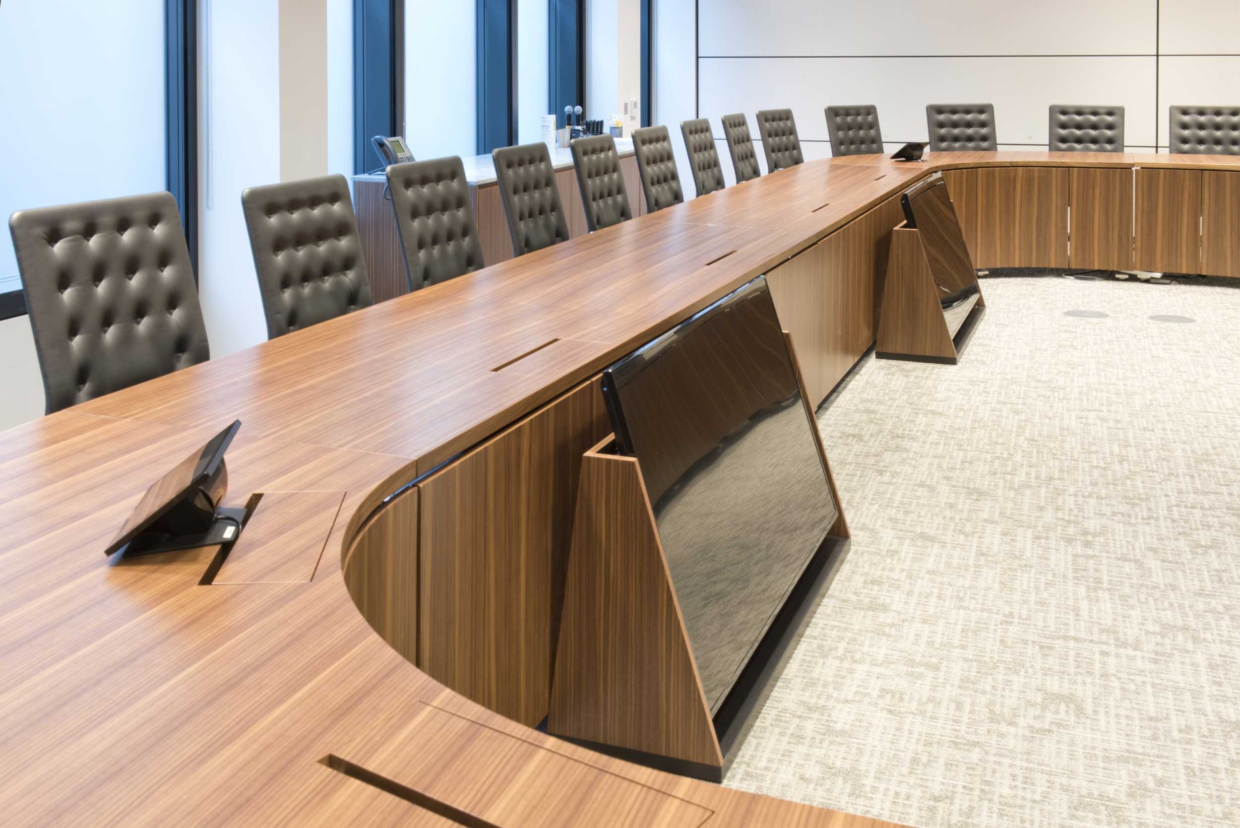
Three courtrooms. Fifteen offices. All different. Plus meeting tables, credenzas and ‘what-nots’.
What a lovely job this was: the sort where you punch the air when you win the tender.
The Supreme Court is a constitutional departure for the UK but one steeped in history. It’s located in the former Middlesex Guildhall, part of a quadrangle bounded by Parliament, Westminster Abbey and the Treasury.
So, you get the idea. This was very special. Both ancient and modern. Everything had to be top notch and pitch perfect. Right, let’s go to the courts. Two are in panelled rooms – the fittings reflect that. One is a new build – and ditto.
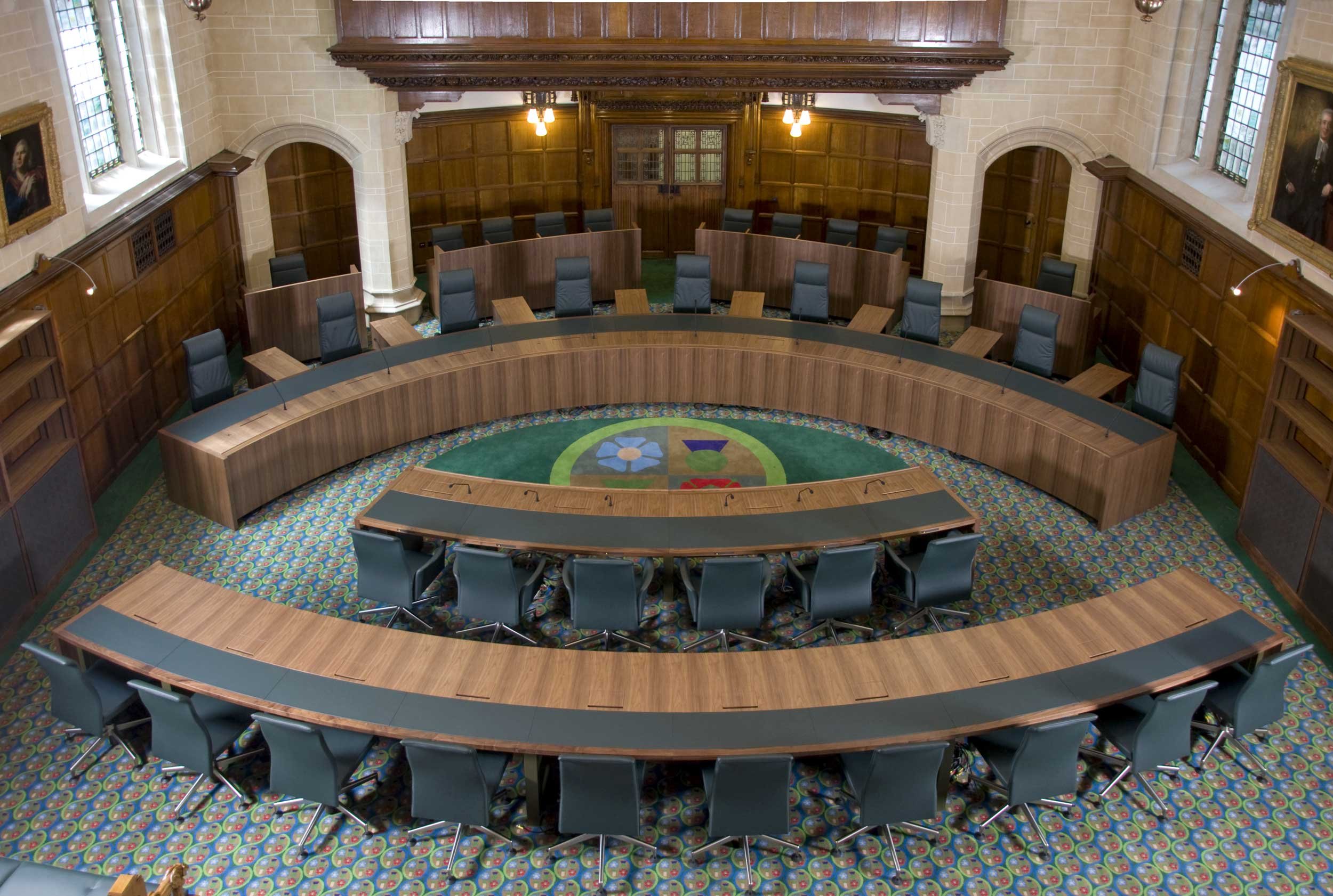
Courtroom One, pictured, is the grandest. This is a nice example of radial veneer on a timber clad steel structure. In this listed room, we restored and reused the original carved pew ends on new public seating with leather upholstering.
Court Two has a lighter, more contemporary oak veneer. The detailing for the Justices’ offices upstairs varied according to seniority. The bureaus are post lipped, with replaceable leather pads. Tomoko added some lovely finesses, like the finger pull on this pedestal.
Beside the desk is the ‘what-not’ — Lady Hale, the Court’s Deputy President asked for them. Popular in the nineteenth century for displaying china, ornaments and what not, here they convey case papers and files.
One modern touch: the marquetry emblem is laser cut. So, a historical setting meeting judicial needs today – and for future Justices not yet at primary school, let alone law school.
Did we get it right? Well, you decide. You can watch the televised proceedings or, better still, pop along and try out our fantastic public benches. Making our legal system more accessible was one of the drivers behind establishing the Court. Being part of that is another reason this was such a lovely job.


