University of London: Senate House Library
Architects: BDP
Giving the University of London’s Senate House Library a new lease of life through timeless interior design and innovative retrofitting solutions.
Start with the Classics
Giving a classic a new lease of life: that was how we approached this extensive project at the University of London’s Senate House Library. Our job was to make this 1930s listed building’s glorious interior — styled by Charles Holden — fit for purpose for the students of today and tomorrow.
Plug it in
Studying isn’t quite the same as it was in the 30s. Designers didn’t have to think about cabling up their designs for computers and the internet. That’s where we come in.
Semester one
The work took place in two stages — and it all started with the classics.
Firstly, we rewired and refitted the iconic Deco tower and Catalogue Hall with its Hornton stone columns and bronze gilded metal panels. We didn’t want to change the look or feel of anything that Charles had created. Just take a look at how we've chemically aged the additional gilding to match the original.
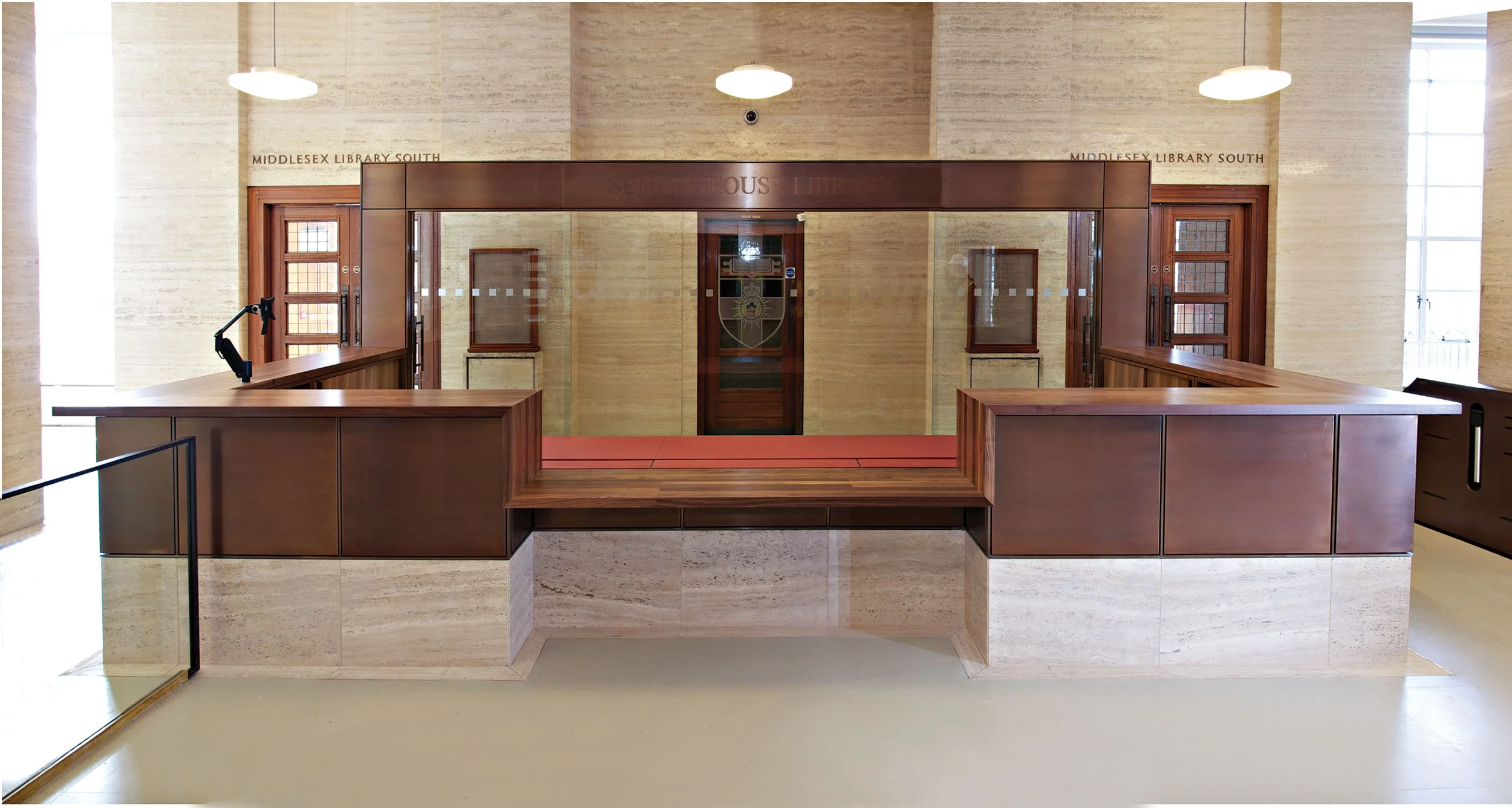
Moving on to the details, those desk tops are solid walnut. And that stonework is from the original source, to make sure it looks like it’s been there forever. Don’t miss the reception with its listed travertine walls. We added a new desk in silicon bronze with a travertine base to match.
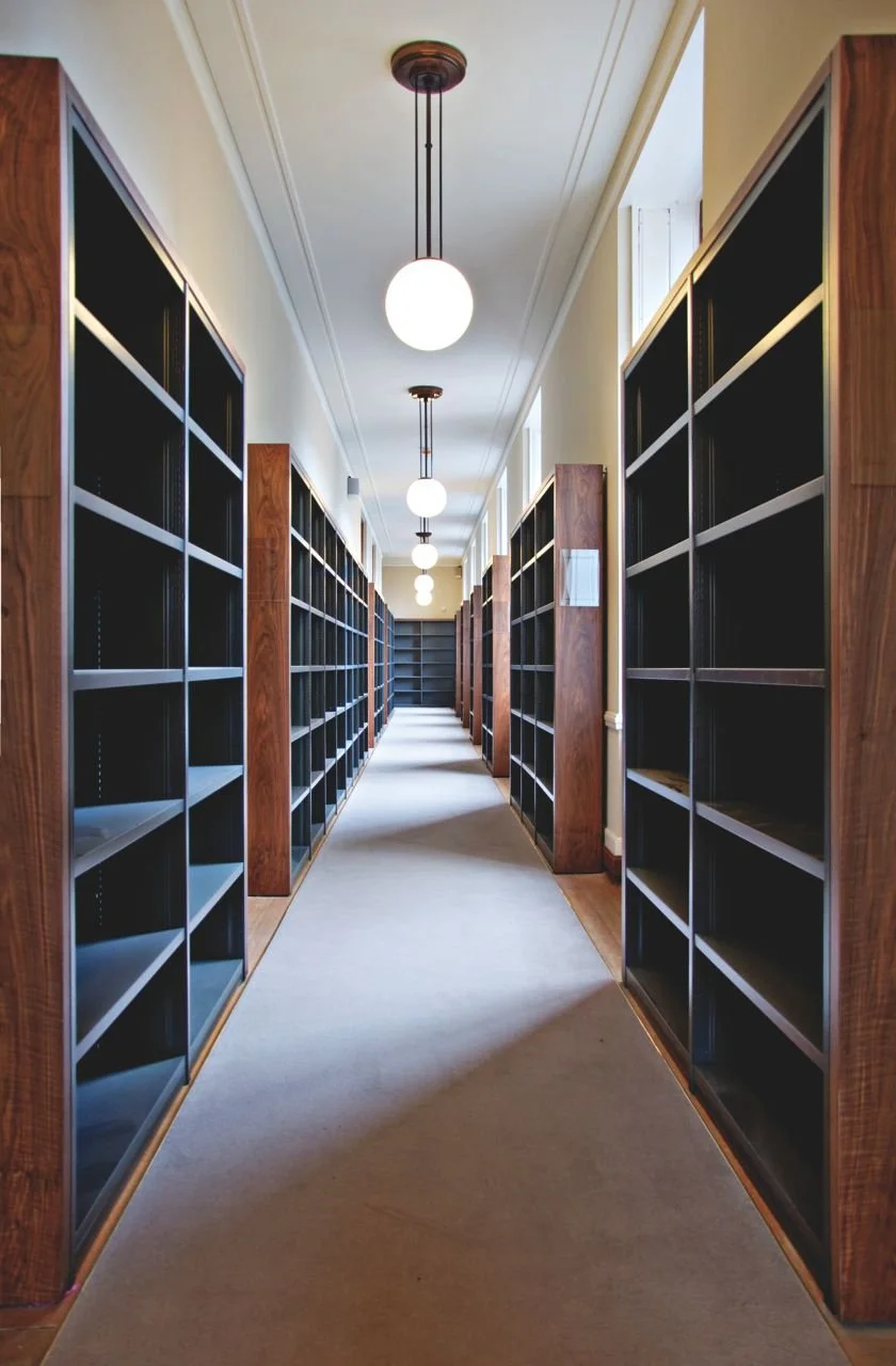
And take a peek into those reading rooms. All the desks we added feature solid walnut edges, lino panels, and a bronze lighting gantry.
Semester two
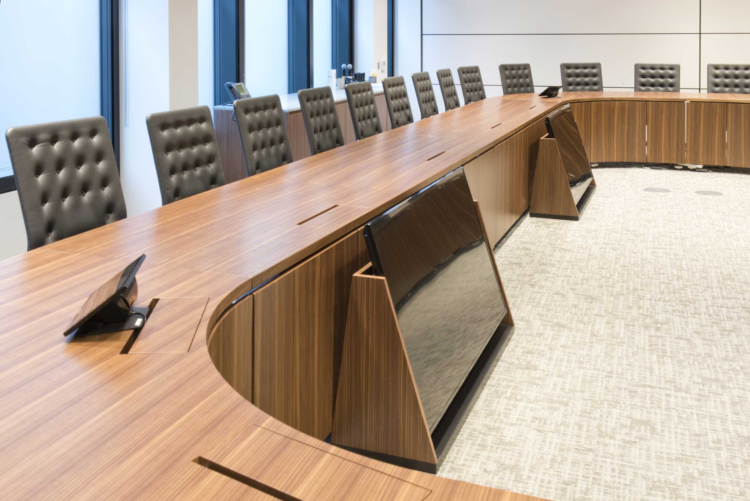
Every student has different study habits, so in the post-war wing, we added desks with individually controlled LED lights. Night owls and morning larks allowed. Our sleek display cabinets are in crystal clear low iron glass — and our sliding doors have concealed runners.
Fancy cabling and lighting aside — the details of which we’ll leave for the textbooks — we retained echoes of the 1930s throughout. Like the striking panelled wall we built in the main lecture theatre influenced by an original detail on the building facade. That textural richness comes from the variations in thickness and sheen of its interlocking panels.
Graduation
All our new fittings live in complete harmony with the magnificent interior that Charles originally created. Now they should be good for another eighty years.
All this subtle harmonisation might pass most students by — but that’s just what we wanted. Because that means today’s students can absorb the same magical experience Charles had envisioned for their scholarly predecessors.


